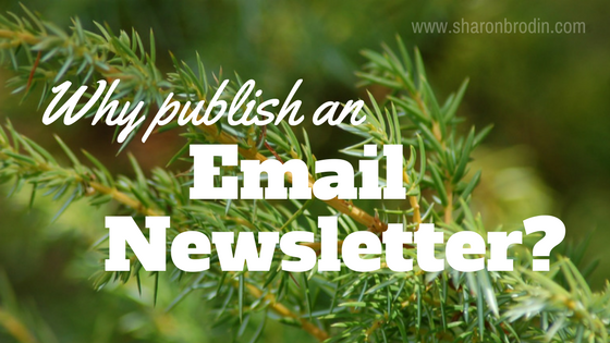
I have two purposes for this post. First, a quick-read reminder that an email newsletter is one of the best marketing tools out there to develop and keep relationships with those are your in-house mailing list.
Second, I put the article in the form of an infographic. Here’s your bonus: Besides the info in the piece itself, I added some tips on using this insanely popular format at the end.
Take a look at the infographic…
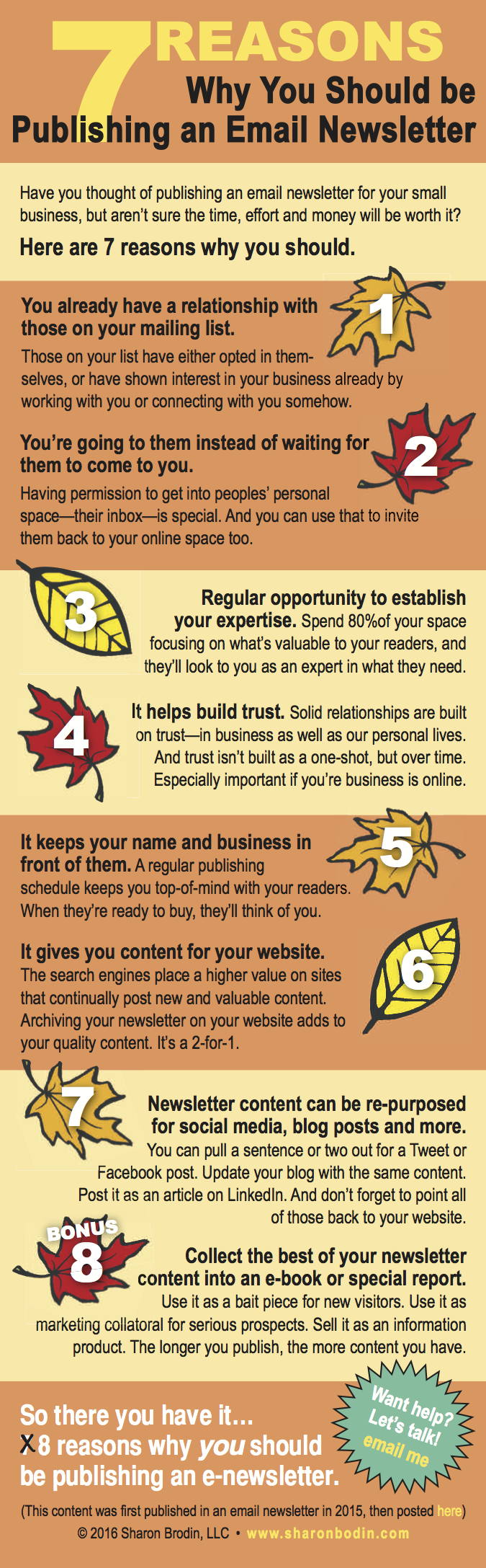
Some things I’d like you to notice about this infographic
- It grabs attention because of the colors and graphics.
- It’s scannable. Each tip is clearly marked, the subheads are bold.
- It’s easy to read. There’s plenty of “white” space (space around the text and graphics). The fonts are big enough and very readable.
- The headline is prominent and there’s a recap at the end.
- The CTA is obvious (call to action). It doesn’t blend in at all.
- Live links. I had to convert this to a png or jpg file in order to place it this page, so the links don’t work. But left as a pdf file, the links are live and clickable. A pdf works great for things like social sharing, SlideShare or a free download.
- This one happens to have a seasonal theme. which can help get attention.
- It fits my brand. It’s relaxed and outdoorsie while still relevant to those not in the outdoor industry. My name and web address are embedded.
They can get much fancier than this one, but you get the idea.
A few quick infographic facts
- Infographics are 30 times more likely to be read than a text article.
- 4 out of 10 people respond better to information with visuals.
- They’re highly sharable.
(Sources: Hubspot infographic, Social Media with PB)